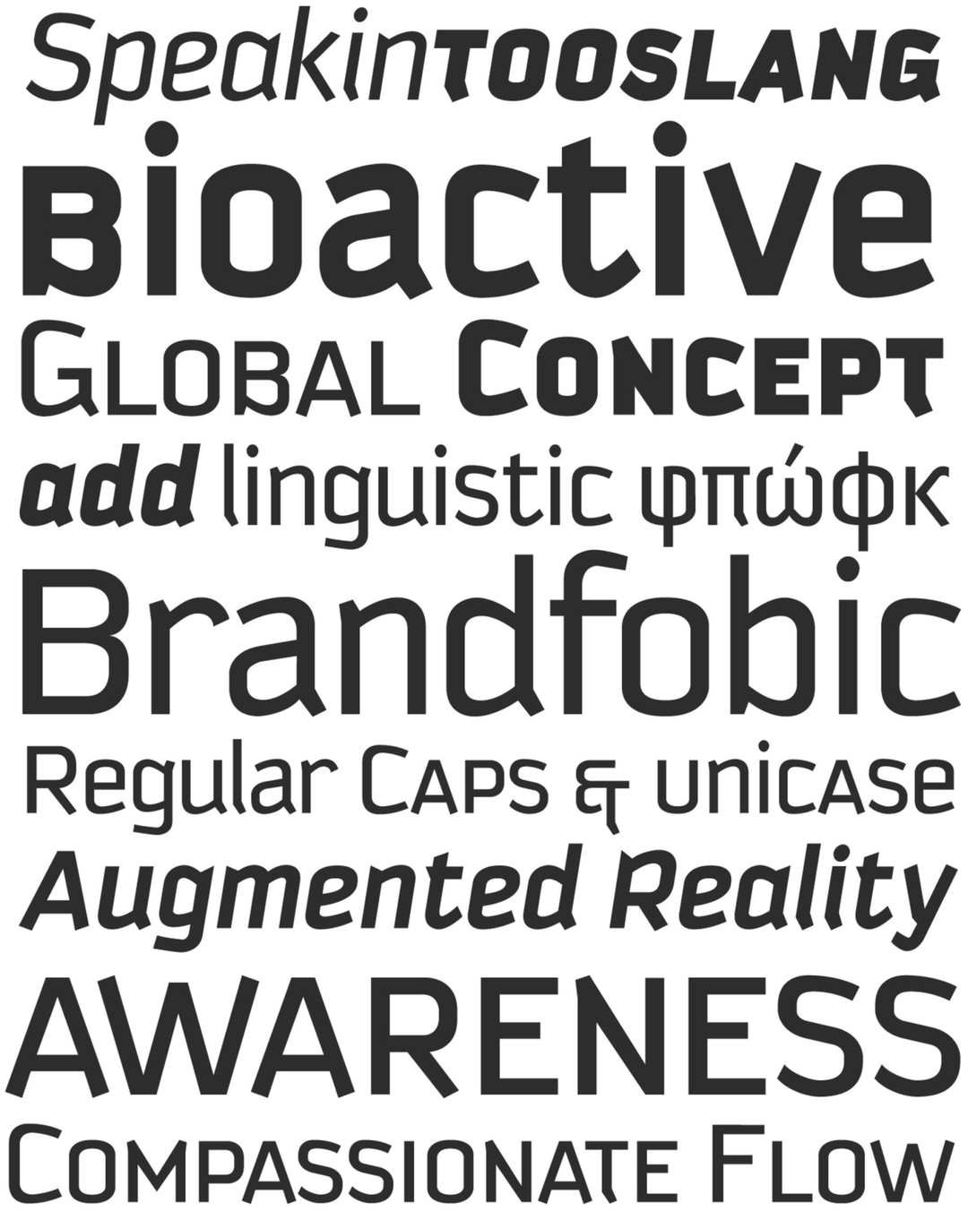
The Kautiva typeface family offers a contemporary solution to the need for neutral communication without sacrificing character. Its design occupies a strategic middle ground: it retains the rationalist structure of geometric sans serifs but softens their execution with humanistic features that enhance readability in extended reading contexts. From an academic perspective, Kautiva stands out for its pragmatic flexibility, allowing for a seamless transition between editorial design for body text and the high-impact demands of display design. It is a work of visual engineering that views typography not as a static element, but as an elastic system capable of adapting to various tones of voice.
Awards and Recognition
2004
Bienal de Tipografía Latinoamericana. Selección
Texto
Texto