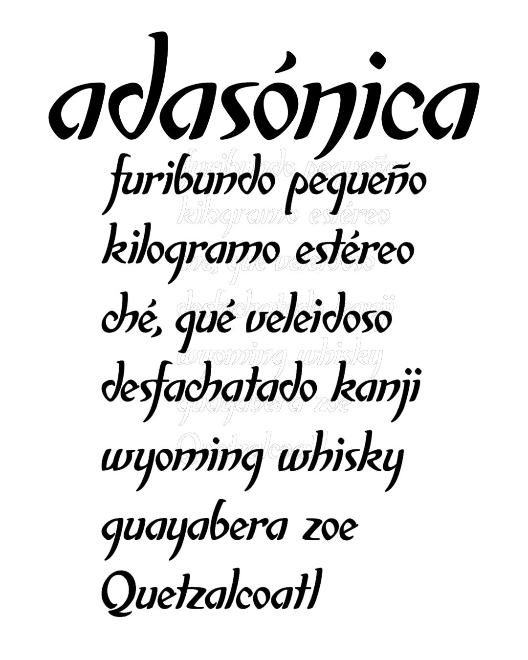
Adasónica began as a brand, starting with a pencil sketch of the lowercase letter “a” in a notebook—a hardcover Rivadavia notebook.
The rest of the characters that make up the brand were drawn directly in Illustrator after a few rough pencil sketches in that same notebook.
It’s a calligraphy-inspired design, but it breaks the basic rules for constructing characters in that discipline.
There’s still work to be done on developing all the uppercase letters and several lowercase ones, as well as refining many of the typographic characters.
Awards and Recognition
2004
Bienal de Tipografía Latinoamericana. Selección
Titulo
Titulo