Borges is a classic text face that combines the dignity and grace of the French Renaissance with a contemporary flavor, close to the Dutch style of the 20th century, that is to say, tall and slightly condensed lowercases with a contrast of strokes barely larger than a garalde. Borges is a humble tribute to the fantastic work of Jorge Luis Borges. His writing technique, that of a meticulous and tireless goldsmith, endlessly searching for the perfect word, suggested a clean and economical letterform. Thanks to its round and open forms, Borges builds a delicate sense of rhythm, providing a comfortable reading in long texts. It was conceived for editorial use, especially in books, although it is suitable for a wide variety of designs. Borges comes in six weights of roman, italic and small cap.
Borges
ID / Registro
#2788
Créditos
Alejandro Lo Celso
Licenciamiento
Público con costo
Fundidora
Pampa Type
Lanzamiento
2001
Clasificación
Texto
Clase
Retail
Variantes
12 Estilos
Nodo(s) Regional(es)
Argentina, Argentina, Argentina, Argentina
Información Verificada
Acceso / Licencia
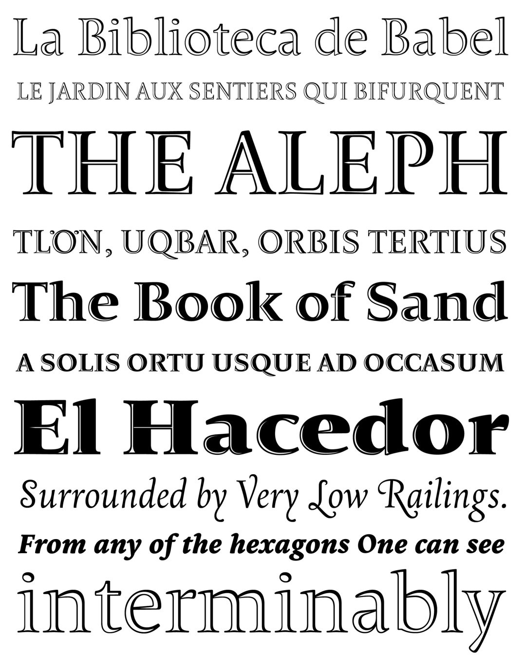
Nota. Espécimen de la tipografía Borges. Derechos de autor por
Pampa Type.
Traducción pendiente - Mostrando original en Inglés
2002
Morisawa Type Design Competition
CITA RECOMENDADA
TipoMap Latam. (2026). Borges. En Mapeo de la Producción Tipográfica en Latinoamérica (registro #2788). UASLP. https://doi.org/10.58493/tipomap — Entrada consultada en https://tipomap.lat/view_typo?id=2788