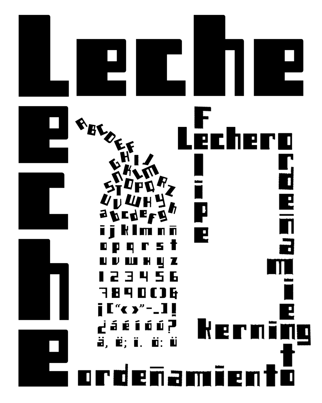
Leche arose from the need to create a logo for a magazine with this name. At first, only the letters needed to form this word were created; later, work began on developing the rest to complete the full alphabet and the remaining characters.
Kerning adjustments are still in progress, and we’re beginning to “milk” the variants.
The shapes are inspired by the metal cans used as measuring containers by milkmen in Puebla.
This font is intended for use in headlines or short phrases.
Awards and Recognition
2004
Bienal de Tipografía Latinoamericana. Selección
Títulos
Títulos