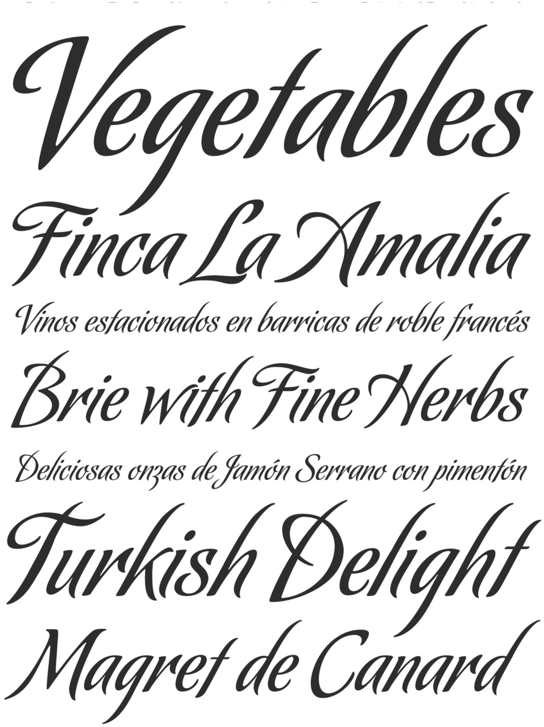
The Koziupack typeface family is an exploration of the formal balance between organic expressiveness and technical rigor. Unlike conventional free-form typefaces, Koziupack introduces a “sharp focus” through curled ascenders and descenders that define the rhythmic space of the word. From an academic perspective, the typeface stands out for its ability to maintain an uninhibited aesthetic without sacrificing structural clarity, thanks to a carefree capital letter design and a unique numeral morphology. It is a display typeface that captures the energy of hand-drawn strokes, providing a vibrant visual solution for projects that demand a bold personality and direct communication.
Awards and Recognition
2006
Bienal de Tipografía Latinoamericana. Selección
Titulo
Titulo