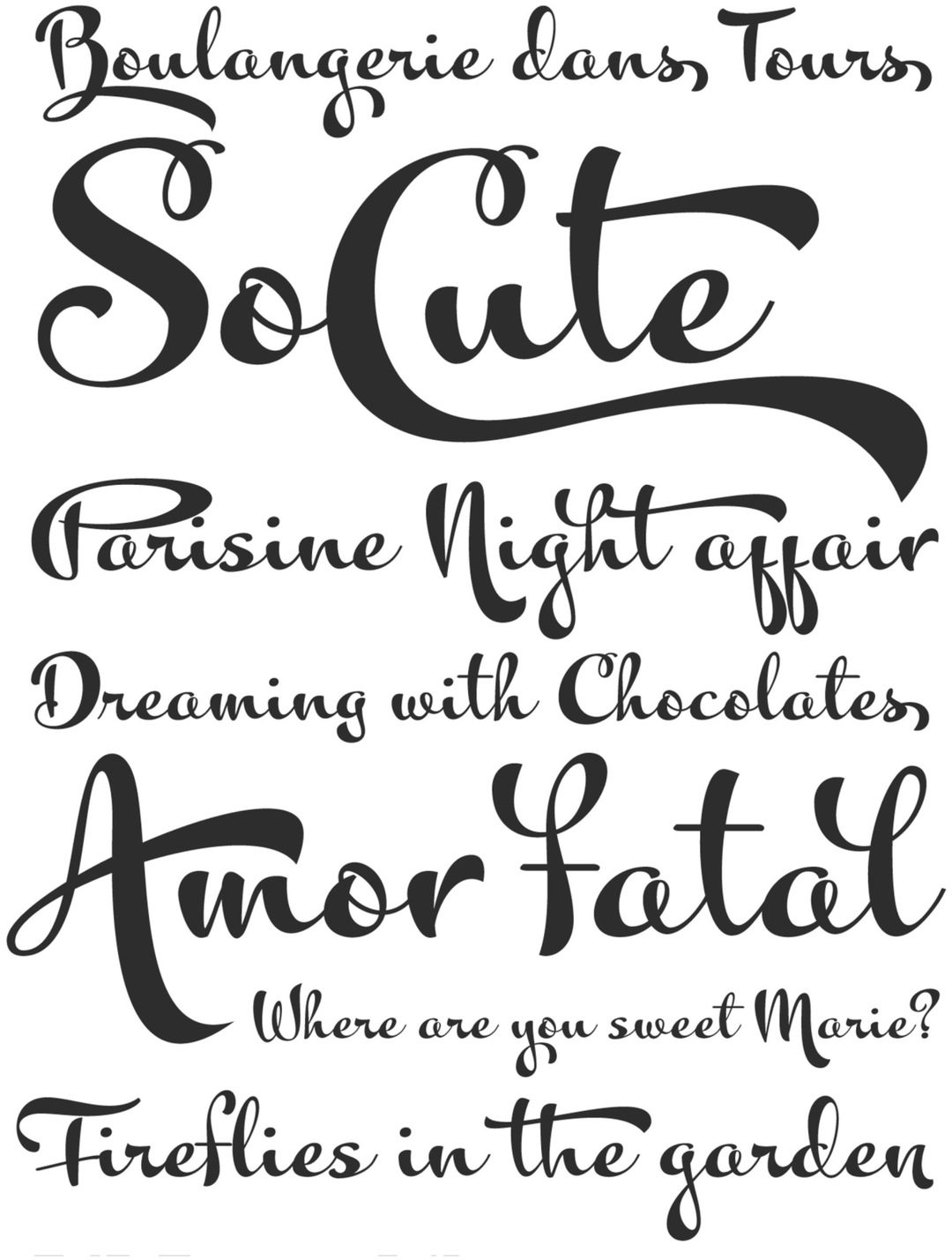
The Kewl typeface family is a fascinating study of retinal persistence in type design. Emerging as a “post-image” of the historical rigor of the Charles Bluemlein collection, Kewl subverts formal New York calligraphy through a South American morphological twist. Academically, the project stands out for its ability to distill the influence of street sign lettering—vernacular sign lettering—into a digital system characterized by heavy, playful strokes. It is a work that documents the transition between classical elegance and popular exuberance, establishing itself as a tool that celebrates the spontaneity and visual vibrancy of Latin American metropolises.
Awards and Recognition
2010
Bienal de Tipografía Latinoamericana. Selección
Titulo
Titulo